
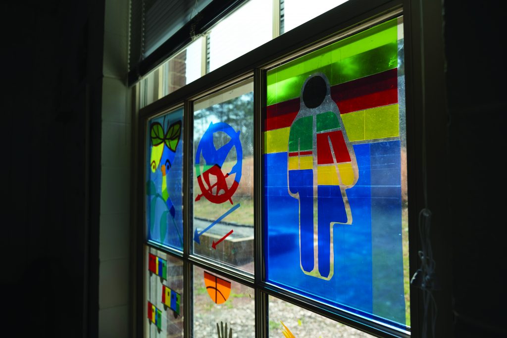
Some of the newest, most eye-catching student art at CA isn’t in Berger Hall; it’s in a math classroom (no, that’s not a typo).
The windows of classroom 128 in the Center for Math and Science—the last classroom in the math wing—are lined with transparent vinyl “stained-glass” suncatchers. When struck by sunlight, colorful railroad cars, peacocks, butterflies, lightning bolts, food pyramids, and abstract hearts throw their colors around the room to magical effect.
Make no mistake—these aren’t just eye- (and sun-) catching artwork. Produced by Upper School Statculus students, they are the latest student-generated data visualizations to grace the Center for Math and Science—every element a deliberate choice to draw the viewer in, to convey a compelling story behind the numbers.
Led by Upper School math department chair Craig Lazarski, Upper School math teacher Kristi Ramey, and art and design teacher Cayce Lee, Statculus offers a deep dive into the connection between calculus and statistics, with a hefty dose of visual arts mixed in. In class, students engage with real-world data to conduct sophisticated analysis, tease out important conclusions, and depict them in compelling and beautiful visualizations.
Those beautiful suncatchers? They reflect student learning in sampling methodologies and complex data analysis. Each represents an opinion data set collected from peers and faculty and parsed using analytical tools that students learned from class. In an array of carefully calculated designs, they offer insights into our community’s preferences—from favorite colors to superhero movies, Hogwarts’ houses sorting to family relationships, sleep habits to dietary choices, and more.
“Your first impression may not be that these are numbers that you’re looking at, but once you think about what you’re seeing, it becomes what Kristi calls a ‘gut-punch’; it communicates something important in a powerful way,” says Lazarski.
Point of Origin
And that, of course, is precisely the point. The ability to work with, interrogate, and powerfully communicate data is particularly timely in a world awash in statistical claims.
“The misunderstanding that people can ‘lie’ with statistics is one of the key reasons everyone should take statistics,” offers Ramey. “It’s not that the statistics are lying; it’s that you don’t know how to interpret the data or that the data is being visually misrepresented.”
Created by Ramey and Lazarski as the product of a 2018 Curriculum Innovation Grant, Statculus was conceived to expand CA’s statistics offerings to better meet the needs of our academically diverse student body.
“We had a wide spectrum of skill levels in a single statistics class—from students who were taking collegiate-level Calculus 3 to those who had recently completed Algebra 2,” explains Lazarski. “Rather than repeat material for students who had already taken calculus and try to bring students who hadn’t up to speed, we decided to offer a more specialized statistics for those students already versed in calculus.”
The result—Statculus—is something akin to a graduate-level statistics course, uniquely tailored to their students’ skills. (It doesn’t hurt that both Ramey and Lazarski are currently pursuing graduate degrees in statistics at NC State University and regularly incorporate material they encounter into their classes).
However, they are quick to point out that mathematics is only one part of the statistics puzzle; communication of the data is equally important. “Statistics is all about communicating. It’s what distinguishes statistics from its calculus lineage,” explains Ramey.
Getting an eye for visual learning
That’s why, in recent years, Statculus has evolved to include a significant and crucial data visualization component, courtesy of a collaboration with Upper School art and design teacher Cayce Lee, and facilitated by yet another professional development opportunity—this one from the North Carolina Museum of Art (NCMA).
The NCMA’s Fellowship for Collaborative Teaching pairs educators from various fields of study who are committed to using art to engage students in new ideas and deepen their problem-solving and critical thinking skills. On hearing of the opportunity, Lee immediately thought of partnering with Ramey, who had long expressed an interest in combining art and math in the classroom.
Selected for the fellowship, in the summer of 2019, Lee and Ramey joined ten fellow educators from across the state in a series of intensive seminars and workshops to design curricula that combined art with other disciplines in meaningful and engaging ways. As the first math-focused pair selected for the fellowship, Lee and Ramey broke new ground for the NCMA program, then in its fourth year, according to Jill Taylor, Director of School and Teacher Programs at NCMA.
For both, it was an eye-opening and fruitful experience, one that underscored not only the vital role of data visualization in statistics, but the importance of visual arts—of color and composition and narrative—in data visualization.
“With artful data visualization, statistics can achieve an emotional response from the audience,” offers Ramey. “Data visualization allows us to provide a point of view along with communicating data. Instead of ‘here’s a pie chart,’ it’s ‘oh my gosh, that was really impactful, and I now see it differently.’”
Clarity of vision
With the COVID-19 pandemic disrupting students’ opportunities to work together in large groups, Lazarski, Lee, and Ramey had to rethink the scope, scale, and purpose of this year’s Statculus data visualization project.
“Last year, we focused on developing students’ communication skills, and their grade was mostly derived from their presentations. Virtual and hybrid learning made that next to impossible, so this year, we leveraged a partner art project to provide that opportunity for them,” says Lazarski.
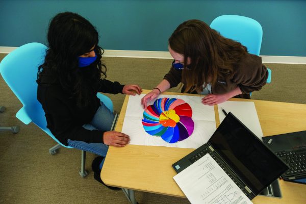
As the suncatcher project was conceived, students were granted control over the data they would collect and analyze, as well as the designs that their suncatcher would use to visualize their results. Students collected and analyzed the data outside of class and then used weekly Flex Days to collaborate and develop their data-driven artwork.
To prepare, Lee introduced students to artworks that incorporated data in thought-provoking ways, such as Timo Aho and Pekka Niittyvirta’s light-painted series on sea-level rise, Mike Knuepfel’s sculptural interpretation of keyboard letter usage, and Blake Fall-Conrony’s Minimum Wage Machine, which provides a tangible sense of how much work is required to earn so little.
It had an impact.
“Usually, when we ask students to take data and do something more with it, what results is a bigger bar graph,” smiles Lazarski. “But our students, inspired by what Cayce had shared, really ran with the suncatcher project. They put careful consideration into the questions they would ask and the best way to produce them as impactful visuals.”
“I have always thought that math is beautiful, but I was excited to present it beautifully!” reflects Shannon Jenkins ’21. “I think my favorite part of the project may have been measuring out the angles that my partner, Sanjana Chillarege, and I used. We had to constantly adapt our methods to make sure that our proportions were accurate.”
“When we first were assigned the project, I was a little overwhelmed—I had no idea how to approach it,” says Samantha Lattanze ’21. “Working through the project step-by-step helped me enjoy the process and provided me with a new lens on math.”
For the teachers, too, it was a rewarding experience. “It’s been fantastic to see students in a different context than the art studio,” offers Lee. “Getting to revisit a key lesson I teach during the ninth-grade art and design class—that visual communication is the most universal form of communication—with real-world applications is particularly rewarding.”
Beyond the classroom
And it is perhaps that real-world application that best prepares Statculus students for what comes next—helping them to better grasp the material by getting truly-hands on, encouraging them to delve into areas of knowledge that they might not have sought to explore, all while honing communications skills that will serve them long after their time at CA.
“Almost every field is about collecting information and analyzing it in today’s world,” says Ramey. “Either you’ll have to interpret data analytics or interpret data yourself. Those communication skills are key in a world increasingly driven by data analysis.”
Lazarski agrees, “Every year, I get emails from young alumni who say, ‘I’m so glad that I took statistics at CA; I use it so much in college, and I wouldn’t have gotten so far without taking it in high school.’”
Across campus, CA students are taking note of the increased visibility of statistics thanks to the installation of Statculus students’ data visualization pieces. “Students in other classes have been intrigued by the suncatchers,” says Lazarski.
“After taking part in the surveys, they have been fascinated by how the results were presented and the notion that meaningful data could be visualized in a non-traditional way. And that you can have fun and make an impact in the process.”
Data Art
This year’s sun catcher project is not the first data visualization project to adorn the Center for Math and Science. Through Lee and Ramey’s NCMA fellowship, last year’s Statculus students were invited to visit the North Carolina Museum of Art and leverage the museum’s collection as data points for a data visualization project.
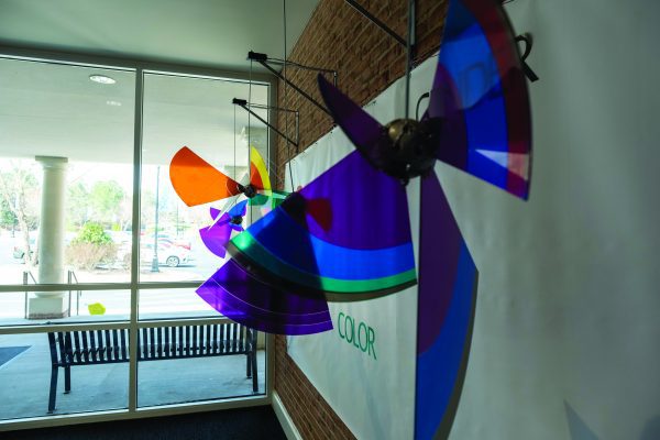
Breaking into teams, students analyzed the museum’s vast collections based on artists’ gender, nationality, media used, and composition. With data sets in hand, and in consultation with RTI researcher and data visualization expert Simon King via Zoom (before it was the cornerstone of meetings in 2020), students worked with Lazarski, Lee, and Ramey to design an art installation that would shed light on the strengths and shortcomings of the museum’s holdings while engaging viewers to learn more.
Inspired by Florence Nightingale’s pioneering data visualization work, Diagrams of the Causes of Mortality, which used a coxcomb—a more sophisticated form of a pie chart in which the slices are subdivided and vary in radius in proportion to the data set—and utilizing the cutting-edge tools of the CMS Makerspace and know-how of design, programming, and robotics teacher Betsy MacDonald, the students created three-dimensional coxcomb spheres that are suspended in the Center for Math and Science’s atrium lobby.
Each sphere—crafted from a Wiffle ball, wedges of plexiglass, and transparent vinyl appliques—is mounted on spindles that allow them to rotate. Putting the data in motion seeks to engage viewers, allowing them to see the relationships between the complex layers of data in greater detail.